As the founder of a marketing agency that specializes in the AEC space (architecture, engineering, and construction), I have strong opinions on what good construction website design looks like.
For residential remodeling companies, most clients come to us having grown their business through word of mouth, without ever investing in marketing. As a result, they often have little to no digital presence. Commercial construction companies typically do have a digital presence — but it’s usually outdated.
Even during market research, we see the same trends. Many of the “big names” in commercial construction have shockingly bad websites. It’s not uncommon for a commercial client to approach us with a non-responsive site — yikes.
So when you go searching for examples of great construction websites, you’ll quickly notice a serious lack of inspiration. Even browsing the construction filter on Awwwards.com is a little scary. Honestly, I’m surprised some of those sites were even accepted.
So here it is — my heart on a canvas. These are the best construction company websites I’ve seen (both Nover’s and others), curated from the 500+ my team and I have reviewed in search of inspiration and best practices.
Best Construction Websites
Nehalem Hardwoods
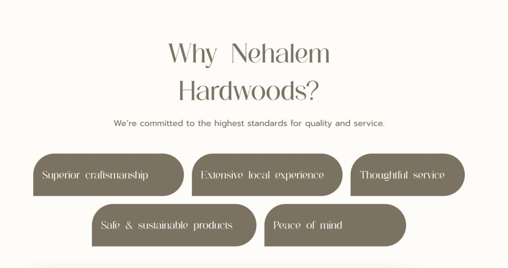
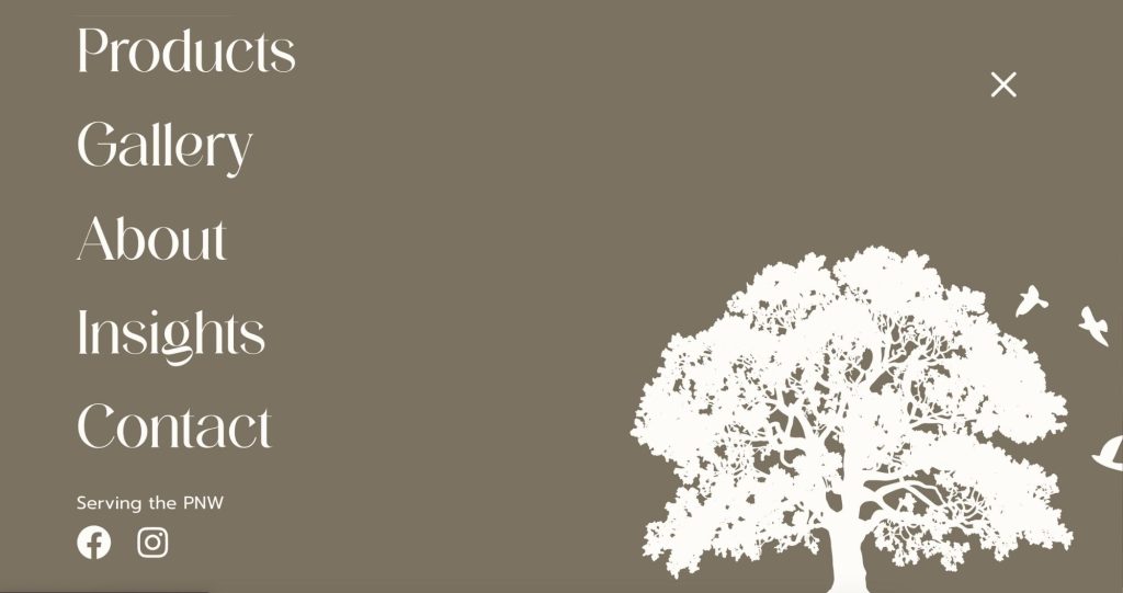
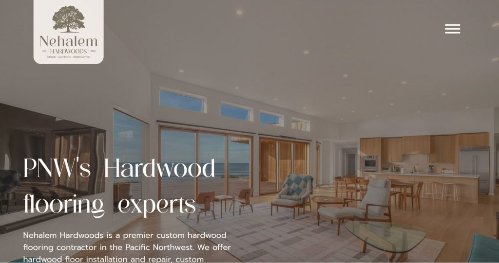
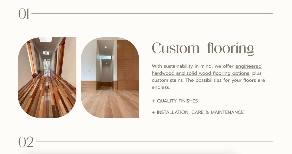
What we love: This site exudes refined luxury. The preloader (what you see before the site loads) draws you in with a smooth zoom-in effect, seamlessly transitioning to the homepage hero with a subtle zoom-out on the text. We also love the use of repeated shapes throughout the site — three rounded corners and one square — a consistent and intentional design choice. Generous white space paired with thoughtful callout text makes the entire experience feel elevated and well-considered.
White Maple Construction
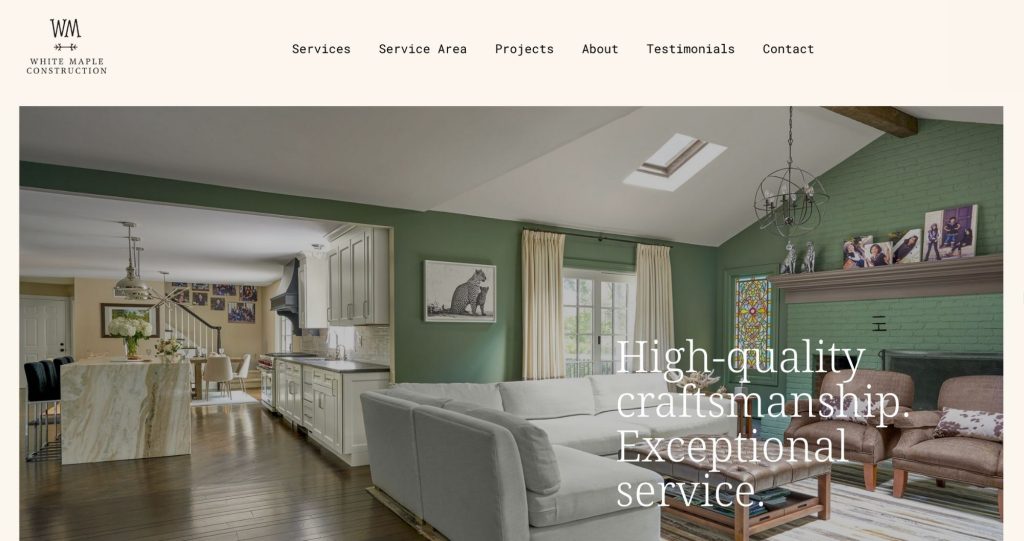
What we love: White Maple’s website is visually a work of art. The design is ultra-contemporary — think Awwwards-level inspiration. There’s a distinct touch of femininity in the color palette and layout, but a technical-looking body font balances it out. Subtle moments of interaction and animation keep the site engaging — like project previews where photos slide up on hover to reveal an alternate view.
Infinity
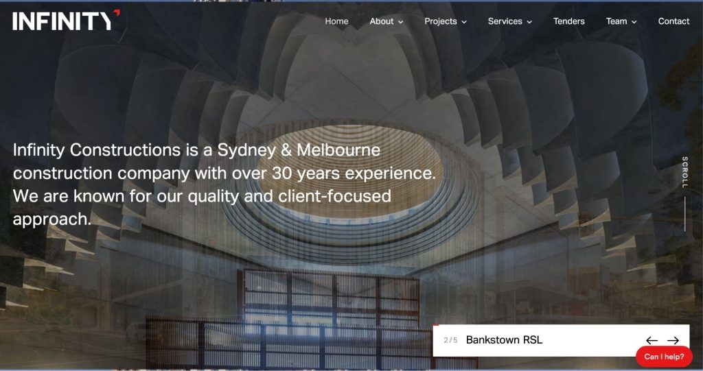
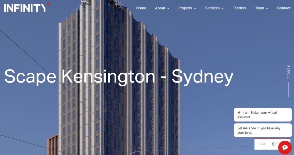
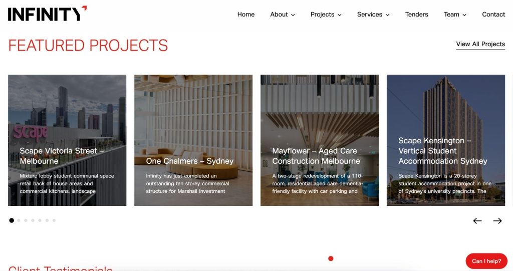
What we love: One of our favorite inspiration sites! The micro-movements and loading animations add a subtle layer of sophistication without being distracting. The repeated left-to-right motion creates a sense of consistency. In web design, repetition is key — it’s what creates a cohesive experience that doesn’t feel like a carnival.
E2 Homes
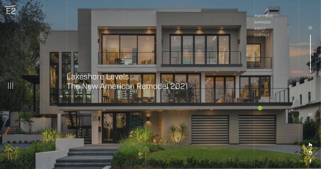
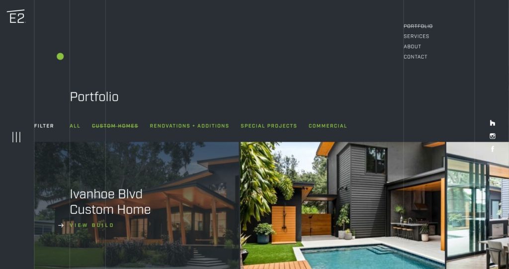
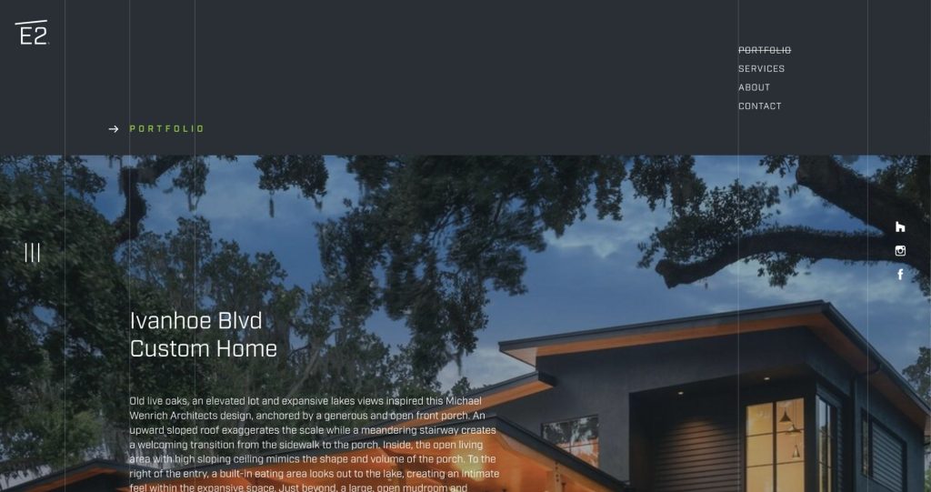
What we love: Can someone say smooth parallax scroll? This site is s-e-x-y—just like their work. Marketing new construction is about more than showcasing the work—it’s about experiencing it. And this website delivers exactly that. Words are minimal. The vibe is strong. It says, “We don’t talk. We walk.”
Z Construction


What we love: Z Construction’s website perfectly embodies the product they sell—luxury coastal homes that exude refined taste. We love the subtle micro-hover interactions throughout the site, as well as the way the heading text uses alternate fonts to emphasize key words and elevate important content.
Oaks Brothers Inc
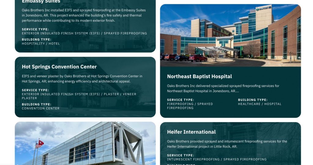
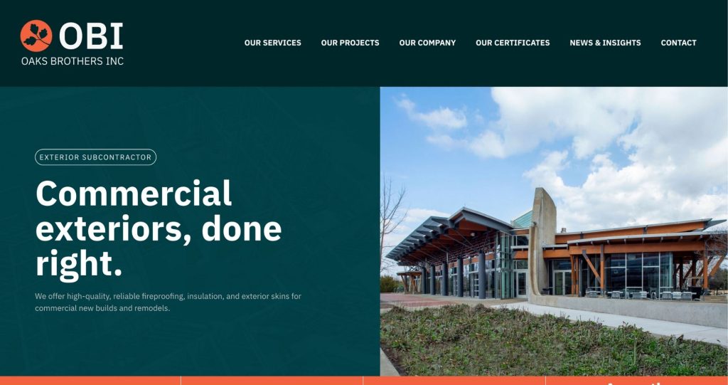
What we love: Oaks Brothers Inc. is a commercial exterior contractor that works with some major clients, including Embassy Suites, Arkansas Children’s Hospital, and more. Orange is definitely a color that walks a fine line in web design, but this site’s use of it is both tasteful and bold without being distracting. We also absolutely love the layout of their project page, which alternates between full-color photos and semi-transparent images incorporating their brand teal.
The Corbo Group
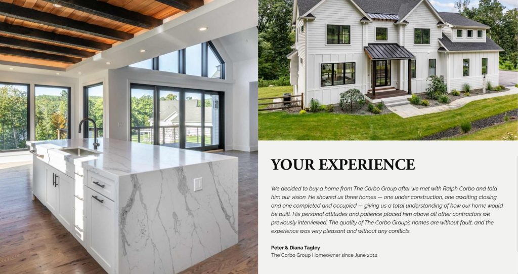
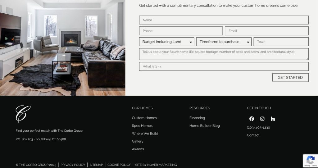
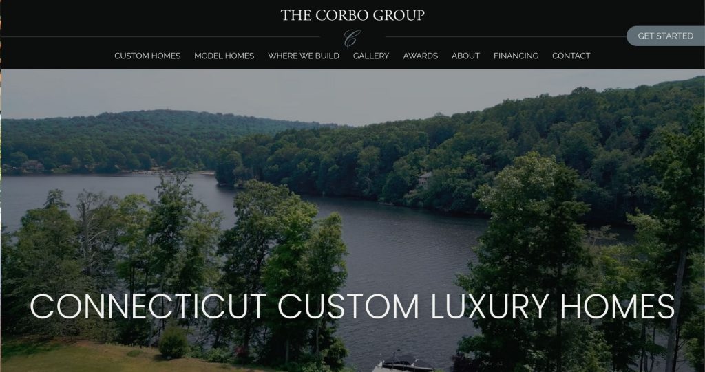
What we love: Corbo is traditional, luxurious, and deeply experienced. It’s a legacy brand—and like Rolex, it commands a certain level of sophistication. This website clearly reflects that identity. Crisp, clean lines, a structured layout, and a neutral color palette of black and off-white set the tone for elegance. The site also prominently features high-quality video footage and interviews.
Hardcore Constructors
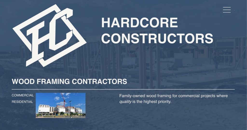
What we love: We love a site that includes product-inspired repetition — so let’s talk about wood. A classic wooden beam is rectangular, and you’ll find a stylized representation of this shape repeated throughout the Hardcore site. The color palette echoes the essence of framing: during that phase, it’s all sky and wood — captured beautifully through the site’s use of blue and off-white. We also love the shrinking logo on scroll on the homepage — a subtle, thoughtful detail.
CORE
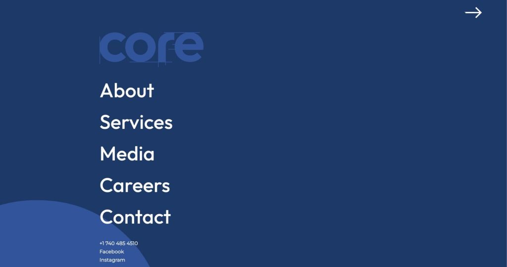
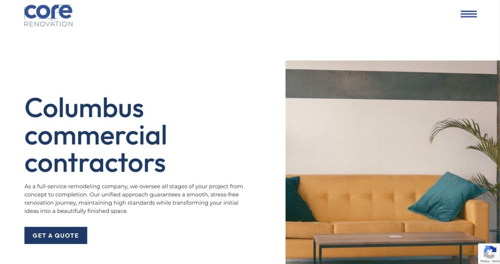
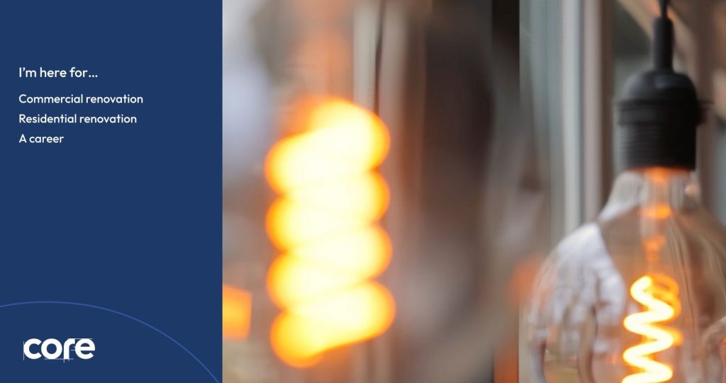
What we love: This site tackles a common challenge our prospects face — how to present multiple service lines with distinct narratives without one detracting from the other. After a sleek preloader, users are prompted to choose between residential or commercial services, each leading to a fully gated, tailored experience. That’s specificity at its finest.
Construction Website Design
We’ve heard nightmare stories from prospects — taking a year to launch a site, agencies misunderstanding the basics of construction…
Hire an agency that specializes in working with busy construction companies. We know how to talk about the work you do, what information we need from you, and how to get it all upfront in one streamlined process.
If you need a strategic partner for your construction website, choose Nover Marketing. Start with a complimentary 30 minute consultation.
