Oaks Brothers Inc. is a commercial exteriors company with a rich history and a stunning portfolio. So, when they approached Nover Marketing about a rebrand, site build, and marketing strategy, we knew this project would be a showcase.
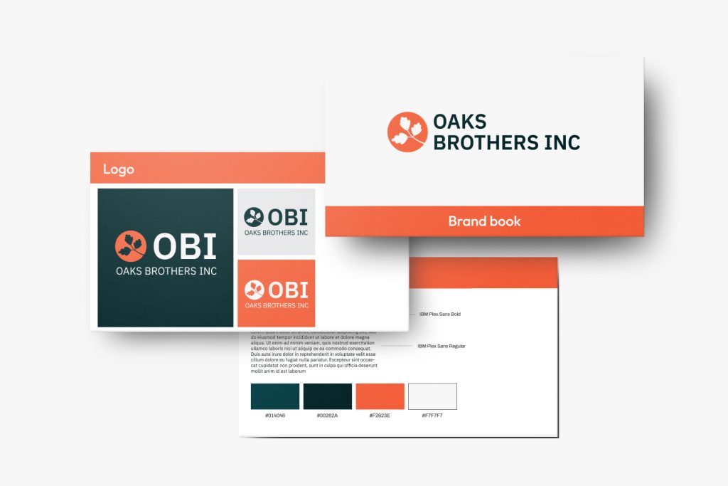
Reliable. Skilled. Proven. These words define Oaks Brothers Inc. Inspired by fall oak trees, the rebrand uses vibrant oranges and greens to reflect their professionalism and strength. The clean, balanced logo captures their craftsmanship and dependability—qualities that make Oaks Brothers a trusted name in commercial exteriors.
Website design
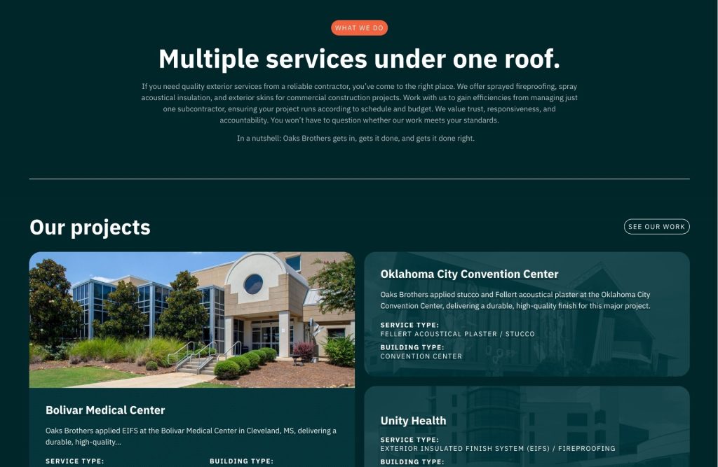
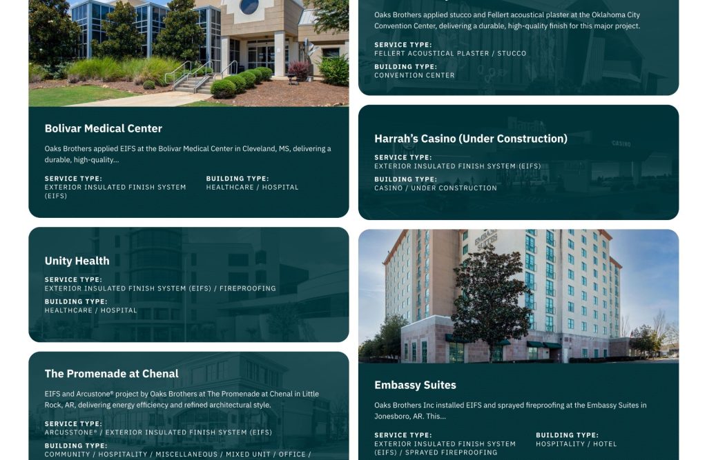
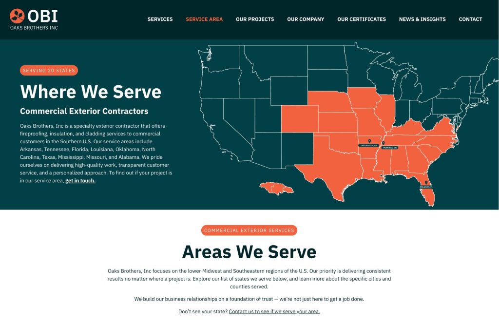
From the structured layout to the bold, modern navigation, the website was designed to reflect the strength and reliability that define Oaks Brothers Inc. Clean lines, confident typography, and warm, natural tones mirror the precision and craftsmanship behind every project they build.
Social
To extend the new brand across digital channels, we created a cohesive social media presence that highlights Oaks Brothers Inc.’s expertise, project portfolio, and longstanding reputation. Bold visuals, consistent branding, and project-focused content reinforce their position as a reliable and proven leader in commercial exteriors.
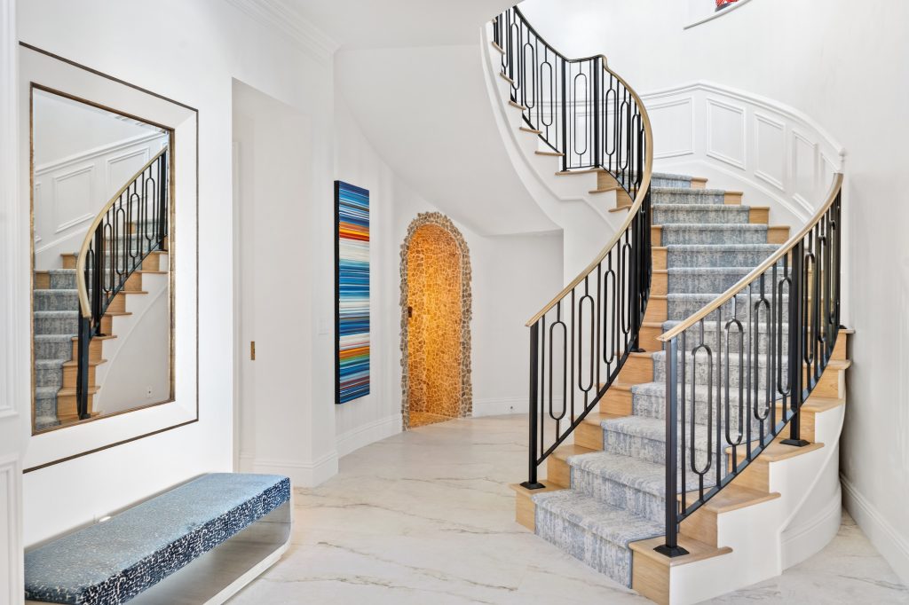
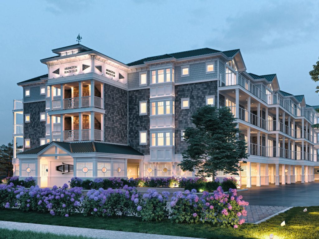
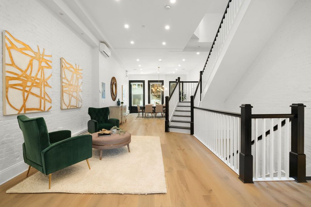
More of our work
We use cookies to personalize your experience, and for measurement and analytics purposes. By using our website and services, you agree to our use of cookies as described in our Cookie Notice & Privacy Notice.